29 June 2017

Link roundup for June 2017

Neil Cohn wins the “Best poster reuse" award for this month:


Neil writes:

Given my last poster, I can't help but design my poster for #CogSci2017 thinking how I'm just going to turn it into pillows afterwards

This short (30 second) video shows the same data, plotted different ways:


D3 Show Reel from Mike Bostock on Vimeo.

Think about what your intuitive reaction is to these different plots. As I have said before, design is all about choices, and sometimes we underestimate how many choices we have in showing our data. You can find more about the data here.

I’m not sure what the difference between a fact box and an infographic is, but I’m intrigued by this article about the effectiveness of fact boxes. Hat tip to Hilda Bastien.

Speaking of infographics, there’s a whole gallery of them here.


Hat tip to Brett Favaro.


I have become obsessed with titles. This slide about headlines makes the point:


On average, five times as many people read the headline as read the body copy. When you have written your headline, you have spent eighty cents out of your dollar.

Hat tip to Barry Adams and Garr Reynolds.

I think I missed this paper on ways to improve data visualization.


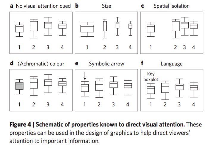
We review four key research areas to demonstrate their potential to make data more accessible to diverse audiences: directing visual attention, visual complexity, making inferences from visuals, and the mapping between visuals and language.

Hat tip to Jarrett Byrnes.

I think whoever made this graph might have benefitted from reading the aforementioned article:


What is going on with that Y axis!? Why is the Y axis on the left and right? Hat tip to Caroline Bartman.


There is a course on scientific illustration 20-24 November 2017 in Barcelona. The course will be taught in English by Julienne Snider, whose work is above.

I don’t drink. So this article’s point resonated with me:

(I)t’s worth thinking about who is excluded in academe when we found our conference conviviality on drink.
Hat tip to Jon Tennant.

Type crime spotted by Ben Valsler, who notes, “Always consider how your layout will look from a variety of angles.”


Hat tip to Dr. Rubidium.

Nice set of typography tips. Hat tip to Ellen Lupton.

California state employees – including public universities – can’t travel to states that discriminate against LGBTQI communities using public funds. That includes for conferences. Simiarly, the Society for the Study of Evolution has struck several states out of consideration for hosting future meetings due to discriminatory laws. Hat tips to Janet Stemwedel and John McCormack.

22 June 2017

Handouts and other papers

The ESA Student Section tweeted:

Conference tip: Presenting a poster? Consider giving some sort of handout: a print out of the poster, or additional info. #ESA2017

It’s a common tip, but I got thinking about it. What’s the purpose of duplicating your poster in miniature?

I’ve always thought the point of having a poster handout was to remind people about your academic work. But I was cleaning off my desk recently, and found quite a few handouts of posters I’d collected from conferences. I’d hauled them back from the meeting, but I hadn’t looked at them for their scientific content or contact information since. The handout had failed in their purpose.

I’m particularly wondering about the trouble of making, carrying, and tacking up poster handouts in the days where these are ubiquitous:


If anyone wants to look at a poster later, why not just take a picture of it? If someone wants my email, why not take a picture of my contact info on my poster?

Granted, there are a few meetings where the conference organizers try to prohibit photographs of posters. It’s dumb and ineffectual, in my estimation, but a handout makes sense at such meetings.

There is value of creating handouts, but not to give them out when people are standing in front of your poster.

First, by making handouts, you force yourself to do the “arm’s length” test. If you can’t read the poster when it’s shrunk down to letter sized paper, your audience will struggle to read the full sized version on the poster board.

Second, you should have handouts so that you can give them to people who are not at your poster session. Most poster sessions are shorter than meetings, but you will be meeting people all through the conference. If you have small handouts of your poster, you can show someone your work at a coffee break, even if your poster session is already over and done with.

Making a poster handout is usually simple. I export my poster as a PDF, and PDFs can be readily printed to fit the size of your printer paper. As I noted above, if you have a good poster that passes the “arm’s length” test, you won’t have to redo or adjust anything.

There are maybe two other kinds of paper that are worth having ready to give.

  • Business cards are compact, socially expected, and can be very beautiful. Even better if they act as invitations.
  • Reprints can be useful if you have already published material that your poster builds upon. People might read those on the plane home.

Related posts

Don’t get mad, get playful
Invitation cards
Link roundup for December 2012

15 June 2017

How many people will show up at your poster?

This Twitter thread by Laura Williams about poster presentations began:

83% expect 10 or fewer poster visitors at large meeting.

This reminded me of an unfinished project: a formula to estimate how many people you could expect at your poster.

This is how far I got:


My efforts were inspired by the Drake equation. The attendance at the meeting (Nr for number ) is the maximum possible number of people who can see your poster (V for viewers). Most of the rest of the terms in the equation are fractions that reduce attendance at your poster.

Looking back on this was, my favourite factor in this equation (mid right) was, “fc = fraction (of attendees) more interested in coffee (than your poster).” And the postscript to that still makes me smile: “GEOLOGY fb = beer.”

Geologists do love their beer, I’ve heard.

09 June 2017

Critique: Demonic

Today’s poster is from Christian Casey, and it won first prize in the student poster competition at the 2017 ARCE Annual Meeting. Click to enlarge!


My first reaction when I opened this file was, “Oh, that is cool.

My major concern was the reading order. Do I go across, or down? I wanted to make sure I understood Christian’s intent before shooting my mouth off, so I emailed him, and got this generous reply:

That was probably the biggest problem I wrestled with while creating the poster, and I don’t think that my solution is perfect. I understand the story as a branching tree of related concepts, which doesn’t lend itself easily to projection into the one and two dimensions of papers and posters, so I struggled to come up with a way of presenting things that conveyed the way I see them.

The idea is that you can read through in more than one direction, depending on what interests you and the amount of prior knowledge you bring, and still experience a coherent story. If you know what problem I’m trying to solve, you can start under the title at “Proposed Solution,” then go to the demo in the center, and then read the extra stuff on the right. If you don’t come with that knowledge, I hoped that you would go to “The Problem” first, read left to right through the top row, and then return to the left for “Proposed Solution.” It is also possible to get a slightly different view of things by going clockwise first, getting the main problem and the sub problems (fonts, input methods), then going to the solution.

When I started working on the poster, I put all of the sections on index cards and then moved them around on a big table until I found a layout that worked. I don’t have any record of the alternative arrangements, but you can get a sense of what I envisioned from the flyer I made to go with the poster.


The timeline is made much more prominent to highlight the importance of the Demotic script in our broader effort to understand Egyptian languages, which is one of the main takeaways that I intended for people to discover. That’s not as clear in the poster, but that was a compromise I had to make during the design process.

The flyer also had a selected bibliography on the back, mainly so that I could avoid using valuable poster real estate for references while still conveying the fact that I had done my research. IIRC I got the idea to do that from your blog, but I don’t remember where or how. You said something about needing to have references, and I didn’t want to do that, so I tried to invent a way to have my cake and eat it too. (Maybe this? - ZF) I ordered prints of the flyers from Moo.com ($50 for 50), and put them in a holder thing under the poster for visitors to take. All 50 had been taken by the end of the second day, so I think people liked that.

I still have concerns some concerns about the reading order. Having a section labelled “The problem” indicates I am supposed to read across, in rows. But it breaks down at “Encoding.”

Having one big central figure helps this poster enormously. The decision to put most of the ancient script in red brings is a smart one. But there is, like many things, a tradeoff. You gain visual interest, but some of the highlighted characters don’t stand out as much as they might have against a more neutral colour. Here’s an attempt to draw attention to the highlighted characters; click to enlarge!


I can see the individual characters more clearly, but the poster as a whole loses its visual punch. Putting the script in gray turns the central space into a drab block that nobody would look at.

The colour choices for the central script from the Rosetta stone are continued throughout the poster, bringing continuity. The minor colours blend well, too. They are distinct enough to be different, but not so distinct as to be distracting.

I also like the addition of the timeline at the bottom. Christian did an excellent job of fitting the timeline to an irregularly shaped space created by his columns.

Finally, while I applaud the placement of the institutional logo down at the bottom, I can’t help but wonder if Christian is a little too modest in the placement of his name. People do care about whose work they are looking at. At a glance, it’s not clear that he is the author. I might have moved his name up next to the title.


It doesn’t do any great damage to the flow of the poster.

The judges who gave out that award made an excellent choice. The combination of both big bold choices and attention to small details make this a very strong poster visually.

03 June 2017

Use black on black for fashion, not posters


Wearing black make you cool. Everybody knows that. But while black on black makes an awesome fashion statement, it is a terrible communication statement.

I saw a poster earlier this year that had its title – the thing that is the only thing most people at a conference will see about your poster – in this colour scheme: dark green text on black.


Rather than posting a picture of the poster itself, I used the eyedropper tool to copy the colours from a picture I took of it on the board. Keep in mind that the colours you see might vary, depending on how the image is positioned on your screen. But I doubt anyone will look at that and think that colour combination makes for easy scanning.

Let’s put the same dark green text over the black, as it was on the poster, and white for comparison:


You have to enlarge and squint to read that text over the black background. The white background makes the text almost infinitely easier to read.

The authors of this particular poster weren’t done, though. They ran with their colour scheme, and used black and green again for section headings. Plus ten points for commitment, minus several hundred points for practicality.


This colour combination is a tiny bit better than the title, but again, it would be easier to read over straight white:


If you liked the black background, you could go the other direction with the text, and lighten the words up:


Forget that black on black looks cool. Your title needs to be high contrast. People have to be able to read your title, at a glance, from a distance.

Journalists call it “burying the lede” when a story sticks the key point of information way down near the end. This poster didn’t just bury the lede with its dark on black colour choices, it buried the lede in an unmarked grave in the woods at night.

Top picture from here.